
ColorCET
Perceptually Uniform Colour Maps
| Summary | Gallery | Download | User Guide | Test Image | Theory |
The Colour Map Test Image
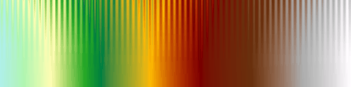
The test image consists of a sine wave superimposed on a ramp function. The sine wave amplitude is set so that the range from peak to trough represents a series of features that are 10% of the total data range. The amplitude of the sine wave is modulated from its full value at the top of the image to 0 at the bottom. Here the image is displayed using a linear grey colour map.
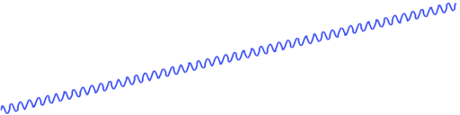

What we are hoping to see is the sine wave uniformly visible across the image from left to right. We also want the contrast level, the distance down the image, at which the sine wave remains discernible to be uniform across the image. At the very bottom of the image, where the sine wave amplitude is 0, we just have a linear ramp which simply reproduces the colour map. Given that the underlying data is a featureless ramp we should not perceive any identifiable features across the bottom of the image. In practice what you see will depend on the settings of your particular display device and how well it reproduces colour. With this linear grey colour map you may find that the contrast at the dark end of the image drops off.
Download the linear test image:
tiff image
ArcInfo ASCII grid file
Grid exchange file.
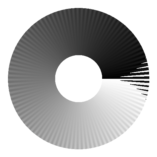
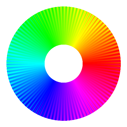
An equivalent circular image for evaluating cyclic colour maps has also been devised. It consists of a sine wave of 100 cycles superimposed on a spiral ramp function. The spiral ramp starts at a value of 0 pointing right, increasing anti-clockwise to a value of 2π as it completes the full circle. This gives a 2π discontinuity on the right side of the image. The amplitude of the superimposed sine wave is modulated from its full value at the outside of the circular pattern to 0 at the centre. The sine wave amplitude of π/10 means that the overall size of the sine wave from peak to trough represents 10% of the total spiral ramp of 2π. It is rendered here using a linear grey colour map to illustrate the cyclic discontinuity. If the colour map is cyclic then this discontinuity should not be apparent.
Download the cyclic test image:
tiff image
ArcInfo ASCII grid file
Grid exchange file
Note the values in this image are cyclic over the range 0-255.
Technical details
Spatial frequency of the sine wave
The sine wave used in the linear test image has a wavelength of 8 pixels. On a computer monitor with a nominal pixel pitch of 0.25mm this corresponds to a wavelength of 2mm. With a monitor viewing distance of 600mm this corresponds to 0.19 degrees of viewing angle or approximately 5.2 cycles per degree. This falls within the range of spatial frequencies (3-7 cycles per degree) at which most people have maximal contrast sensitivity to a sine wave grating. This point of maximal sensitivity will depend of the viewing conditions, in particular the mean luminance of the stimulus (Olzak and Thomas 1986; Van Nes and Bouman 1967). A wavelength of 8 pixels is also sufficient to provide a reasonable discrete representation of a sine wave. The aim is to present a stimulus that is well matched to the performance of the human visual system so that what we are primarily evaluating is the colour map's perceptual contrast and not the visual performance of the viewer.
A possible concern with this choice of spatial frequency is that it biases the test towards discrimination of light-dark variations rather than chromatic variations. However, there is no escaping the fact that when we look at an image we want to be able to resolve features at this scale, and finer. Spatial acuity performance on chromatic gratings is significantly lower than it is for achromatic luminance gratings (Poirson and Wandell 1993; Mullen 1985; Lennie and D'Zmura 1988). Mullen (1985) indicates that the contrast sensitivity function of red-green and blue-yellow gratings is characteristic of a low-pass filter. Performance starts to decrease significantly for spatial frequencies greater than about 3 cycles/degree with resolution ultimately failing at about 11-12 cycles/degree. In addition to spatial frequency effects at small fields of view, below 0.5 degrees of viewing angle, there is a severe loss of colour discrimination and ultimately below about 0.3 degrees an observer with normal trichromatic vision becomes dichromatic (Thomson and Wright 1947). For reference, a 10mm screen object viewed at a distance of 600mm subtends about 1 degree of visual angle.
Thus, if we are interested in an ability to resolve fine structures in a pseudo-colour image it is the light-dark variations in the colour map that will dominate.
Modulation of the sine wave amplitude
The sine wave amplitude increases with the square of the distance from the bottom of this image. This provides a gradual rate of increase in the amplitude with a reasonably wide, low contrast, region at the bottom of the image allowing us to see the colour map on a ramp.
Evaluation of some colour maps
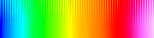
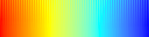
Show below is the test image rendered with some colour maps from widely used software packages. Note the false anomalies that often arise at yellow and cyan and also note the regions where the sine wave pattern can completely disappear. The vendors represented by these colour maps include Mathworks, Mathematica, Geosoft and ESRI.
Rainbow colour maps are particularly problematic. For a detailed discussion of their poor characteristics you should refer to the paper by David Borland and Russell M. Taylor, Rainbow Color Map (Still) Considered Harmful. IEEE Computer Graphics and Applications, Vol. 27, Issue 2. March 2007. pp 14-17. See also Peter Kovesi. "Good Colour Maps: How to Design Them". arXiv:1509.03700 [cs.GR] 2015


References
- David Borland and Russell M. Taylor, "Rainbow Color Map (Still) Considered Harmful". IEEE Computer Graphics and Applications, Vol. 27, Issue 2. March 2007. pp 14-17.
- Peter Kovesi. "Good Colour Maps: How to Design Them." arXiv:1509.03700 [cs.GR] 2015
- P. Lennie and M. D'Zmura 1988. "Mechanisms of color vision." Critical Reviews in Neurobiology 3. pp 333-400.
- K. Mullen 1985. "The contrast sensitivity of human colour vision to red-green and blue-yellow chromatic gratings." Journal of Physiology (London) 359. pp 381-400.
- Olzak, L.A. & Thomas, J.P. (1985). "Seeing spatial patterns." in Handbook of perception and human performance. Editors: Kenneth R. Boff, Lloyd Kaufman, and James P. Thomas. Wiley, 1986
- A.B. Poirson and B.A. Wandell 1993. "The appearance of coloured patterns: Pattern color separability." Journal of the Optical Society of America 12. pp 2458-2471.
- L.C. Thomson and W.D. Wright 1947. "The colour sensitivity of the retina within the central fovea of man." Journal of Physiology (London) 105. pp 316-331.
- F.L. Van Nes and M.A. Bouman. 1967. "Spatial modulation transfer in the human eye." Journal of the Optical Society of America 57.