
ColorCET
Perceptually Uniform Colour Maps
| Summary | Gallery | Download | User Guide | Test Image | Theory |
News December 2024:
Petrel/DUG .alut colour maps have been corrected are available in the download section
Summary
This website presents a collection of perceptually uniform colour maps.
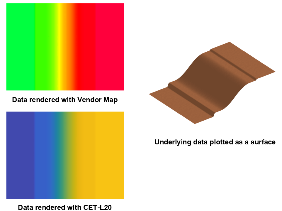
Many colour maps provided by vendors have highly uneven perceptual contrast. Colour maps may have sections of low perceptual contrast that prevent you from seeing significant features in your data. They may also have points of locally high colour contrast leading to the perception of false anomalies in your data when there are none.
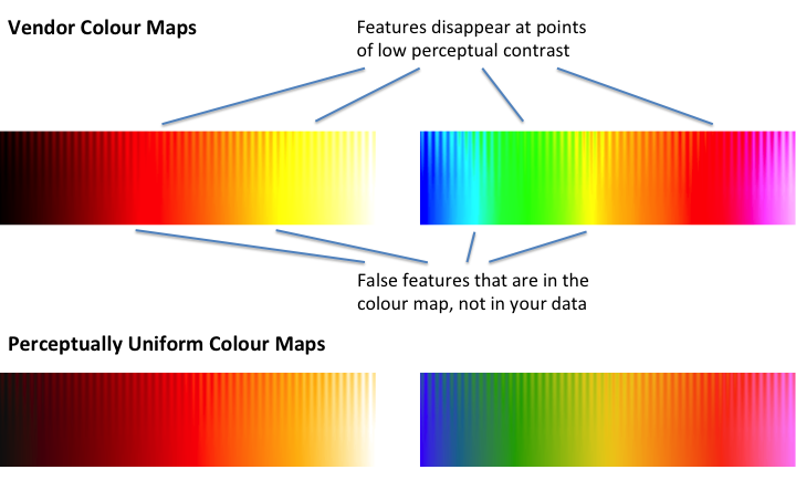
The colour maps shown above are rendered on a test image consisting of a sine wave superimposed on a ramp function. The amplitude of the sine wave is progressively reduced to zero at the bottom of the image.
What we should see is the sine wave uniformly visible across the image from left to right. We also want the contrast level, the distance down the image, at which the sine wave remains discernible to be uniform across the image.
At the top of the test image the sine wave height from peak to trough is 10% of the total data range. It is not unusual for the sine wave pattern to completely disappear in parts of some vendor colour maps. At the bottom of the image we just have a linear ramp which simply reproduces the colour map. Given that the underlying data is a featureless ramp we should not perceive any identifiable features across the bottom of the image.
What difference does this make?
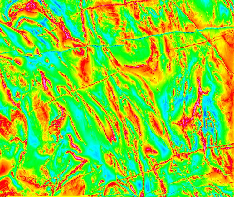
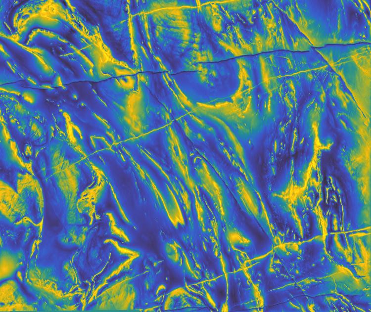
On the left is the result of rendering an aeromagnetic image of the Yilgarn region in Western Australia with the default colour map of a widely used geophysics package. On the right is the same data rendered with the perceptually uniform colour map CET-L20.
The vendor map exhibits a large perceptual dead zone at green, a smaller dead zone at red, and false features at cyan and yellow. A lot of very expensive data has been corrupted and lost!
 |
 |
 |
 |
| Vendor Map | CET-L20 |
|---|
To convince you further shown below is the rendering of some synthetic data that has been specifically constructed to illustrate the size of features that can be hidden in the perceptual dead spots of the vendor map shown above. I think you will agree the result is very alarming. If you did not have access to the colour bar would you be able to tell whether the data values in the green zone were higher or lower than in the red zone? How would you interpret the yellow line?
Organisation of the Colour Maps
The colour maps are organised according to the attributes: Linear, Diverging, Rainbow, Cyclic, Isoluminant, and Colour Blind.
![]()
Linear colour maps are intended for general use and have
colour lightness values that increase or decrease linearly over
the colour map's range. Such maps are also known as sequential maps.
![]()
Diverging
colour maps are suitable where the data being displayed has a well
defined reference value and we are interested in differentiating
values that lie above, or below, the reference value. The centre
point of the colour map will be white, black or grey. It should be
noted that, in general, diverging colour maps have a small perceptual
flat spot at the centre. The exception being linear-diverging maps
which avoid this problem.
![]()
Rainbow
colour maps are widely used but often misused. It is suggested that
they be avoided because they have reversals in the lightness gradient
at yellow and red which can upset a viewer's perceptual ordering of
the colours in the colour map. However, they are attractive and
perhaps can have a legitimate use where the main aim is to
differentiate data values rather than communicate a data ordering. I
believe the rainbow colour maps presented here have minimal badness
though they do have localised perceptual flat spots at yellow and red.
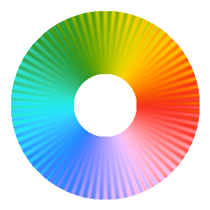
Cyclic colour
maps have colours that are matched at each end. They are intended for
the presentation of data that is cyclic such as orientation values or
angular phase data. They require particular care in their design (the
standard colour circle is not a good map).
![]()
Isoluminant colour maps are constructed from colours of equal
perceptual lightness. These colour maps are designed for use with
relief shading. On their own these colour maps are not very useful
because features in the data are very hard to discern. However, when
used in conjunction with relief shading their constant lightness means
that the colour map does not induce an independent shading pattern that
will interfere with, or even hide, the structures induced by the
relief shading. The relief shading provides the structural information
and the colours provide the data classification information.
![]()
Colour Blind colour maps. These are not designed to be merely
'colour blind safe'. These maps have been constructed to lie within
either the 2D model of protanopic/deuteranopic colour space, or the 2D
model of tritanopic colour space. Hopefully by working within these
colour spaces people who are colour blind will be able to share a
common perceptual interpretation of data with those who have normal
colour vision. It also ensures maximal use of the available colour
spaces, and allows chroma and lightness to be properly used in the
design of colour maps. I would value any feedback on the usefulness,
or otherwise, of these maps. For more information you can view a
conference
presentation describing the design of these colour maps.
View the Gallery to see the full collection of colour maps.
Software
- MATLAB code that was used to generate and analyse these colour maps.
- Julia Package for the generation and analysis of colour maps.
Cite
If you find this work useful please cite this site, colorcet.com, and the paper:
Peter Kovesi. Good Colour Maps: How to Design Them.
arXiv:1509.03700 [cs.GR] 2015
Other Useful Colour Map Resources
- Scientific Colour Maps by Fabio Crameri.
- Fabio Crameri, Grace E. Shephard and Philip J. Heron The misuse of colour in science communication Nature Communications 11, 5444 (2020).
- Viridis and other maps by Stéfan van der Walt and Nathaniel Smith.
Acknowledgments
This work was supported by the Centre for Exploration Targeting in the School of Earth Sciences at The University of Western Australia.
I am indebted to Tom Horrocks for his help in generating the colour maps for ArcGIS.
The aeromagnetic image of the Yilgarn region in Western Australia was generated from data that is the property of Fugro Airborne Surveys Pty Ltd.
Contact
Peter Kovesipk@peterkovesi.com